Increasing Camping Accessibility and Community
Timeline
2020
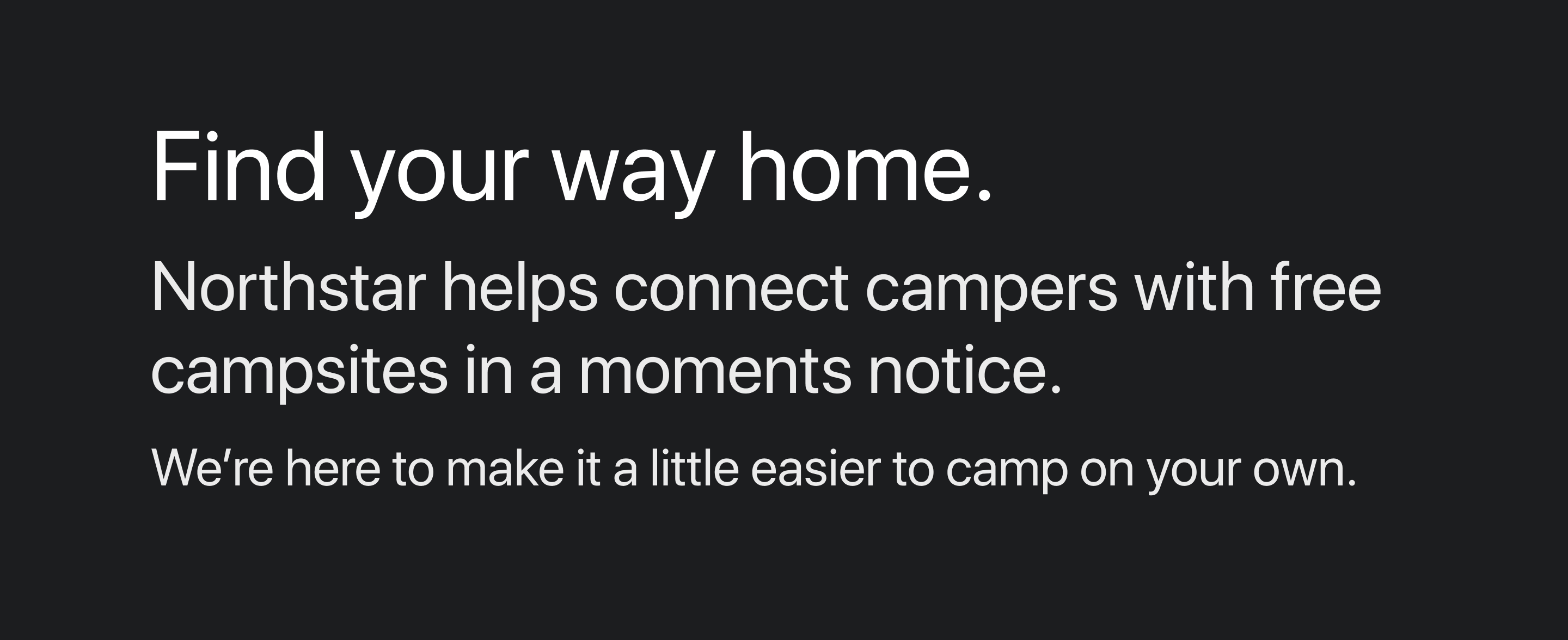
About
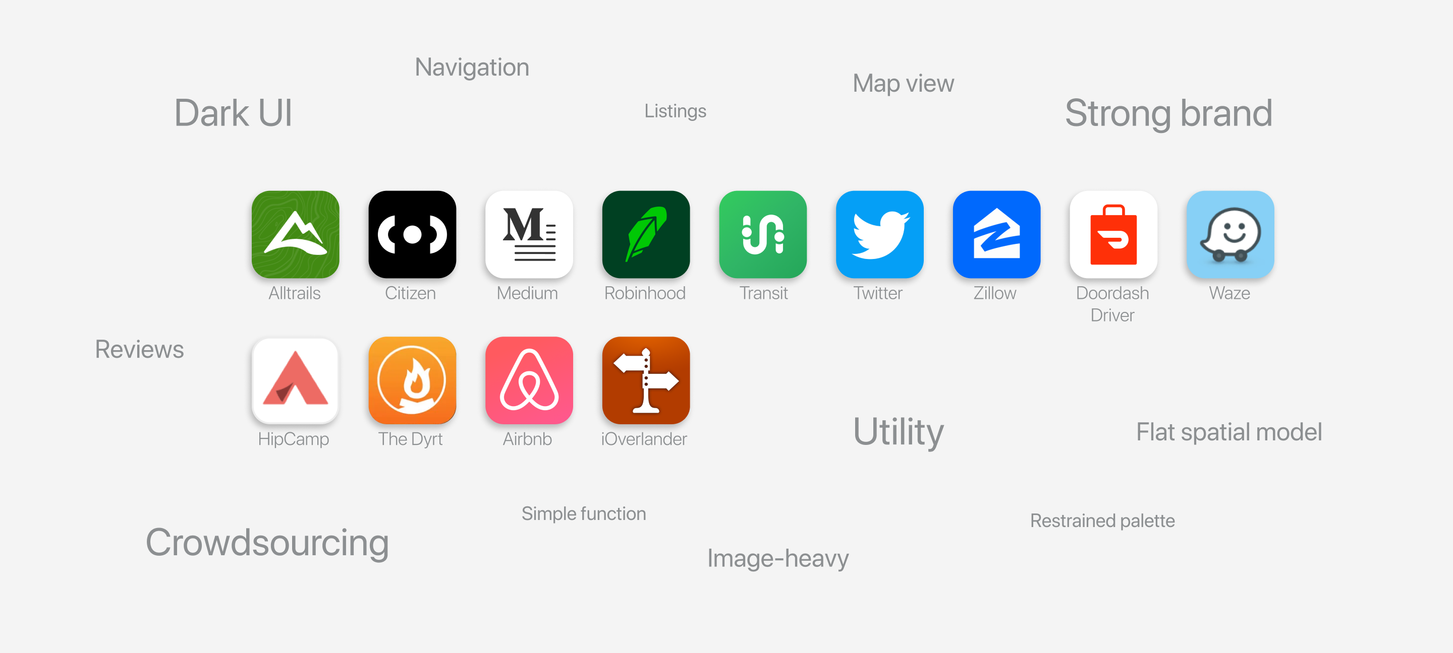
Dispersed camping can be tricky; the majority of existing camping apps and websites only list paid options on private land. While great for a lot of people, these options are not ideal for those who need a quicker and more flexible accommodation.
I worked with mentorship from Punchcut Senior Designer Julian Brown to conceive and design a digital tool that connects campers with free campsites in a moment’s notice.
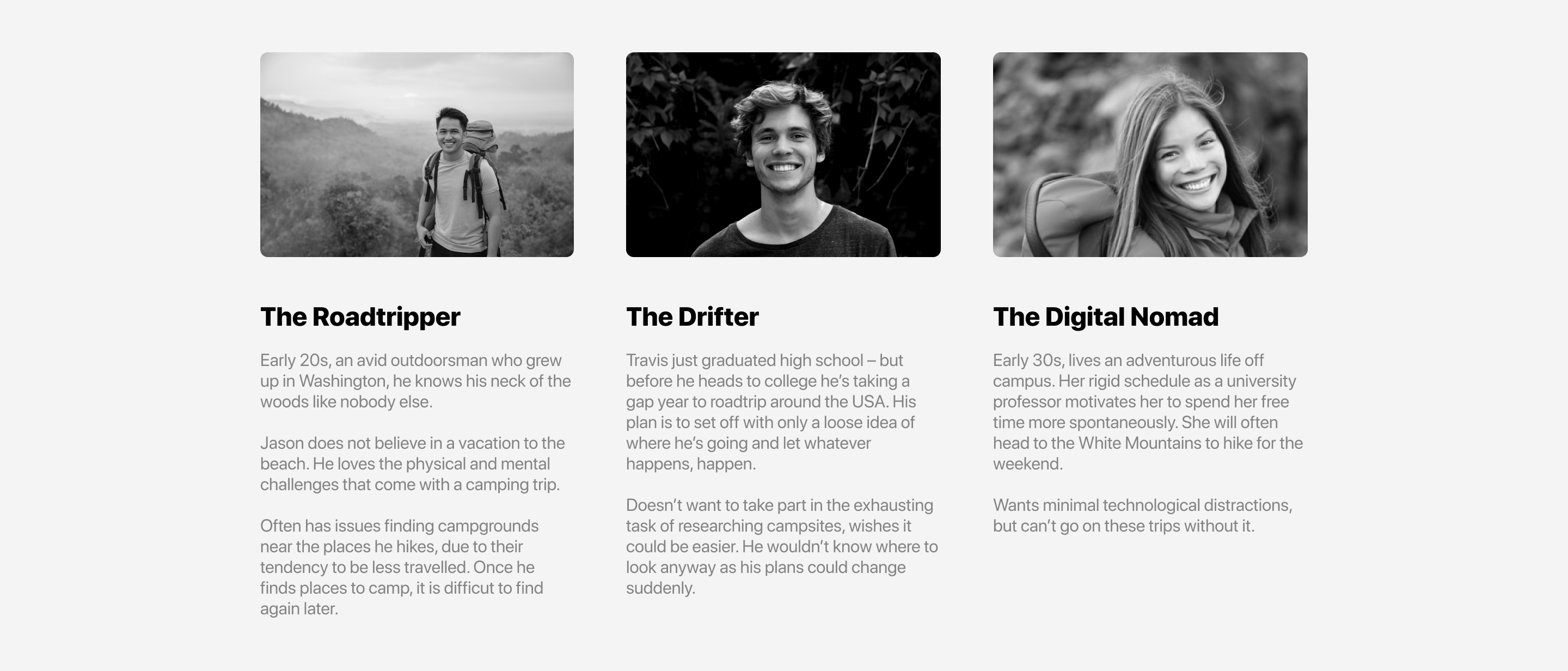
Understanding the User
Among American young adults, a lot of people are living more nomadic lifestyles. They see roadtrips as an opportunity, and take every chance they have to get out and travel.These technologically savvy individuals are free-spirited and optimistic. They don’t like to plan out too much of their future, because they know plans change – and that’s alright by them.
Design Goals
- Educate users on the Northstar methodology in an approachable way.
-
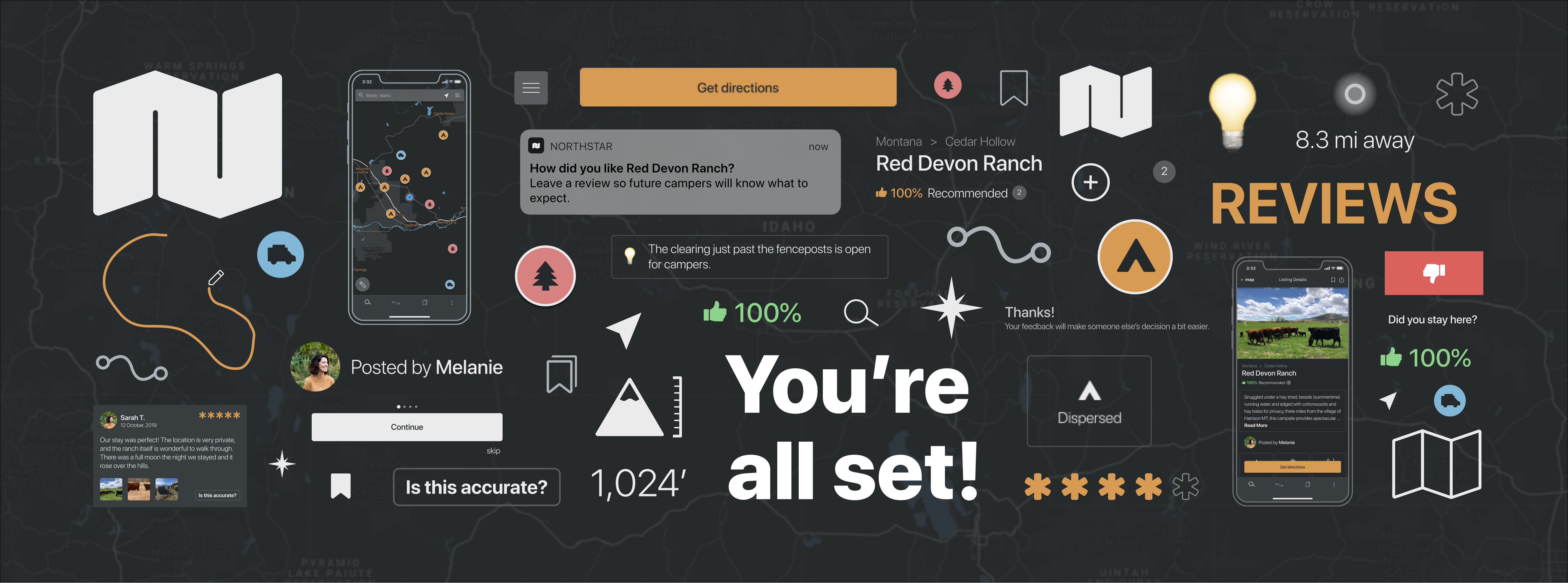
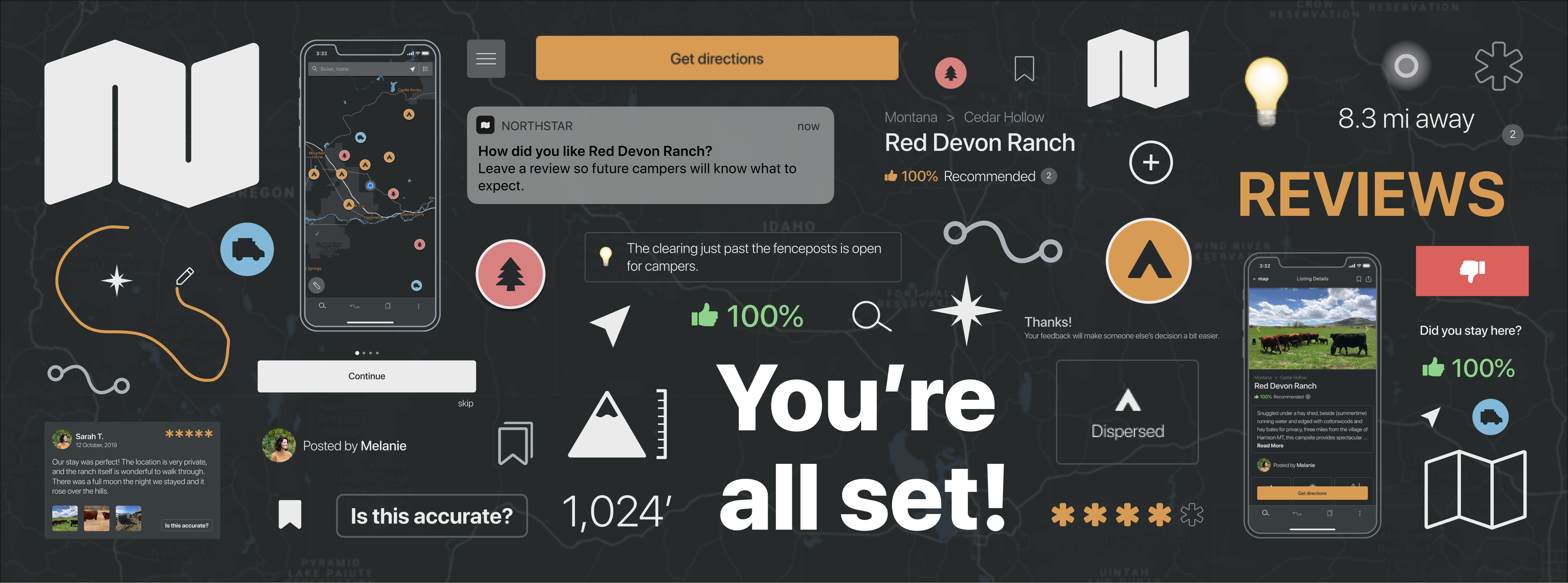
Help users locate campsites nearby or along a route.
-
Help users to feel safe choosing a campsite by incorporating ratings and reviews for campsites and users.
-
Encourage users to leave feedback and add listings.
Brand Language
Precision – Inspires confidence that information is accurate and exact.Dominant theme of visual concept.
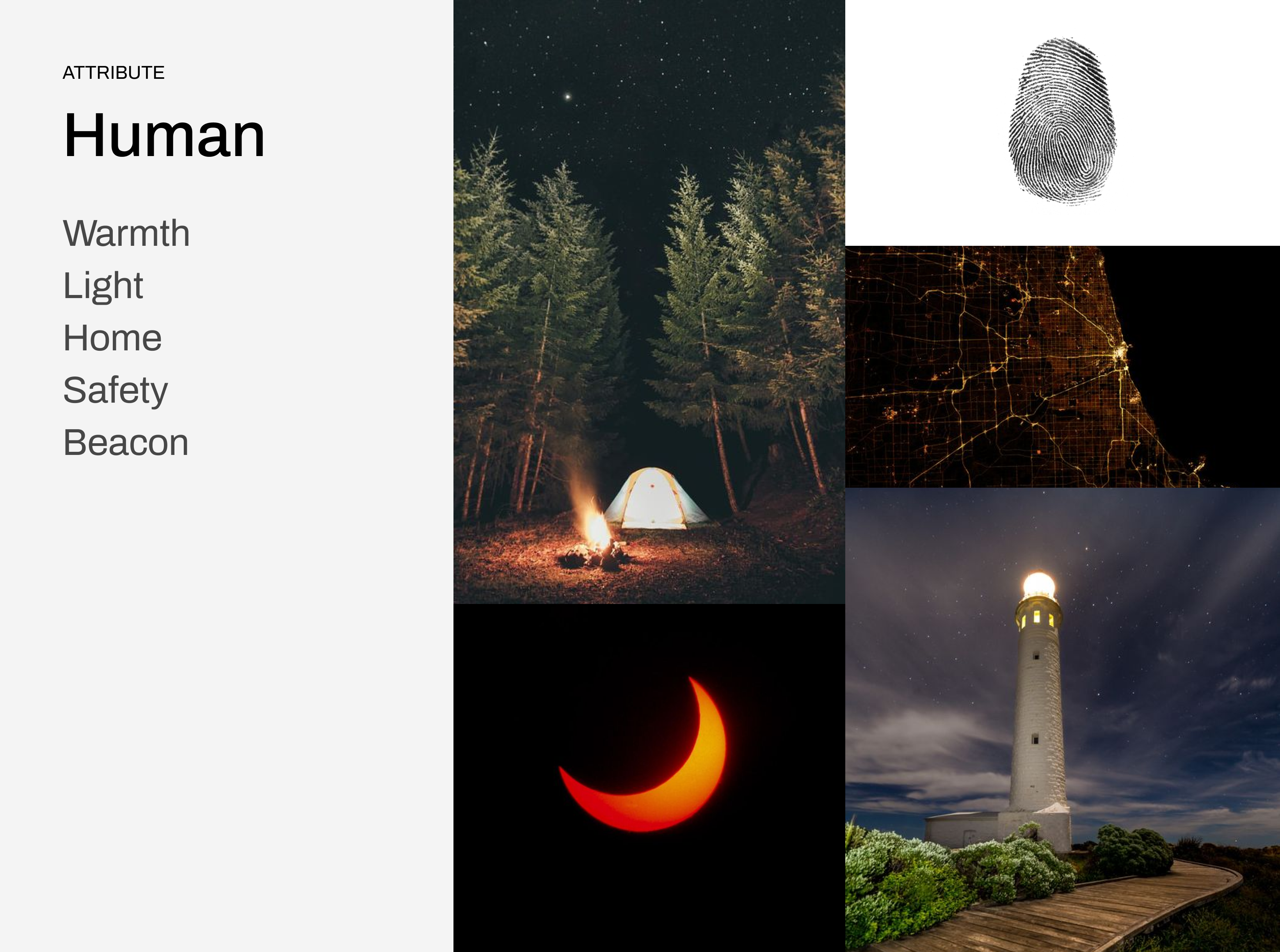
Human – Comforting and relatable, inspires trust and feelings of safety.
Most prevelant in voice & tone, community interaction (reviews and feedback).

Dark Mode
Users will most typically use the application at nighttime and while on the road. So while a dark UI is relevant to the brand language, it is functionally a measure for user safety and comfort.
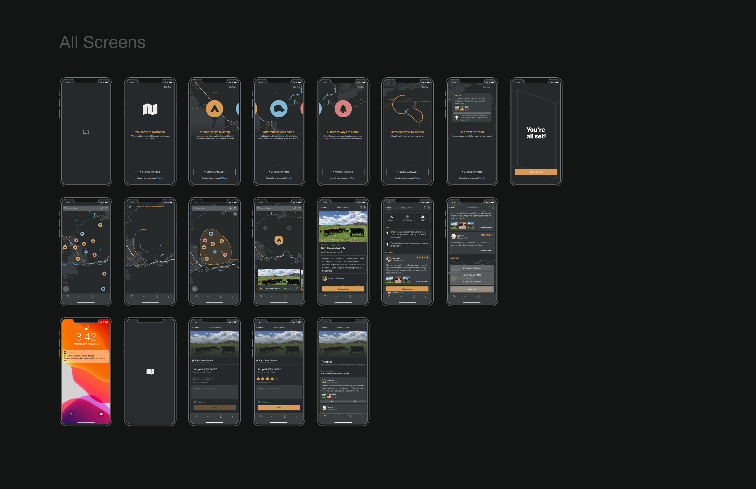
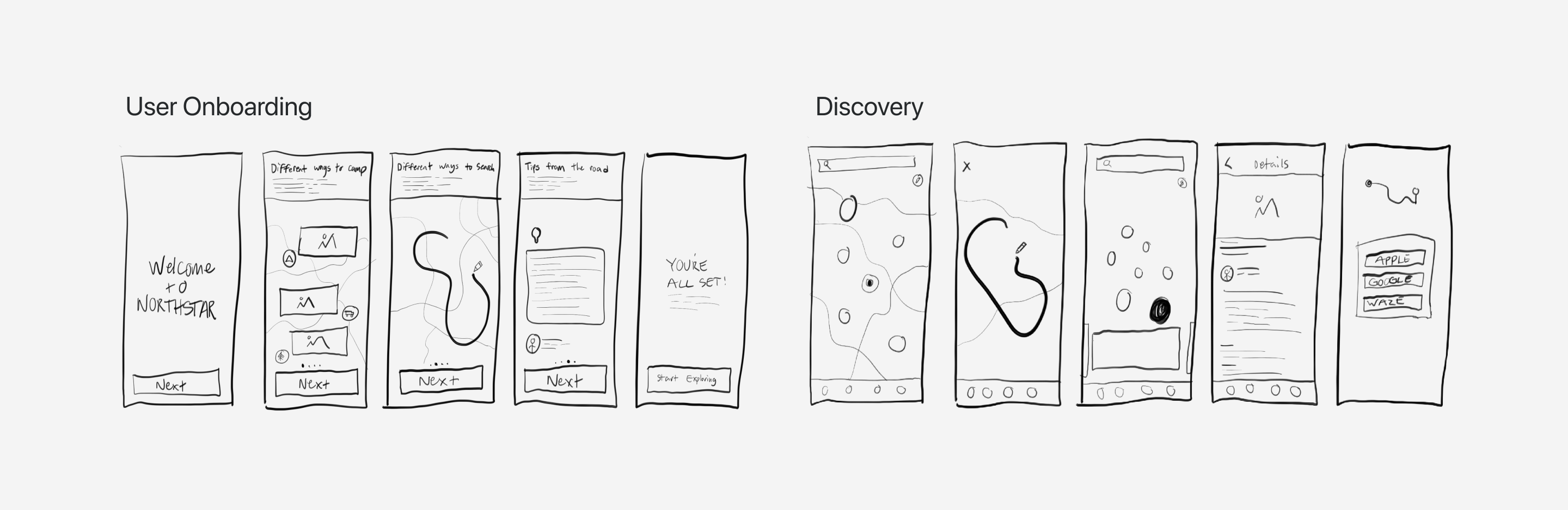
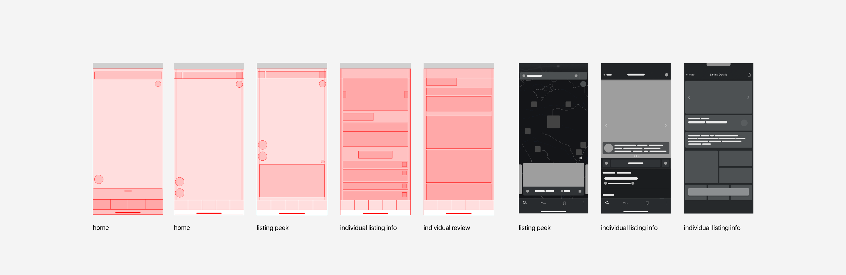
Task Flows
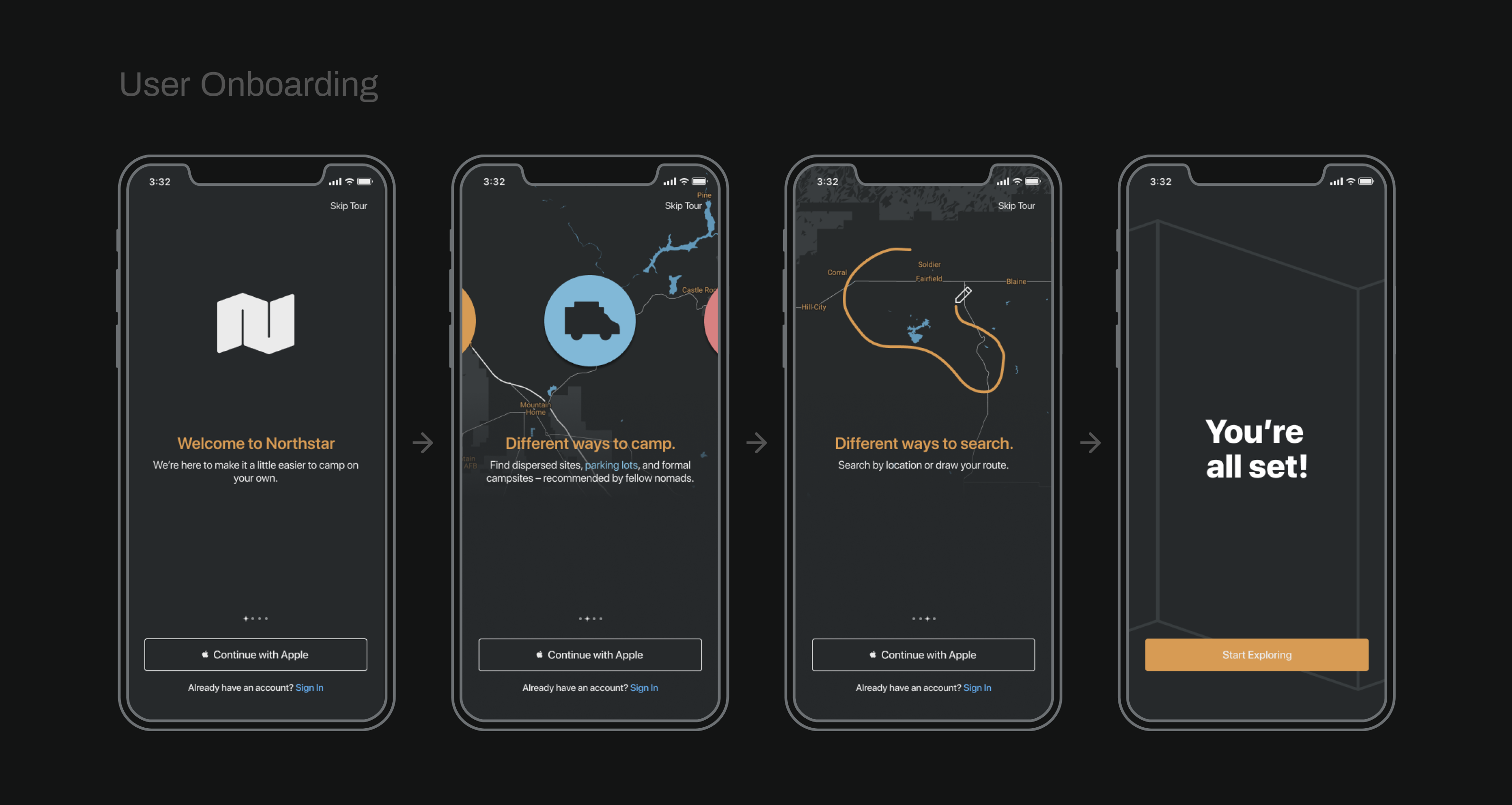
- User onboarding
-
Discovery
-
Nudge-based feedback